Showing posts with label Toolbar. Show all posts

Saturday, February 14, 2015

How to create a toolbar with LinsUIWPF Suite

Download   Demonstration  Question?   Contact Us


1.     Follow the link How to create a new project to create your project with LinsUIWPF Suite.
2.     Highlight “MyDemo” project folder, and Project->New Folder to create a new folder named “Icons”.
3.     Project->Add Existing Item …, and select icons to add them into the “Icons” folder.
4.     Project->Add New Item …, it should bring up the following dialog.

Choose “WPF” as Category and “User Control (WPF)” as Template. Use “MyToolBar” as the class name. Click “Add” button.
5.     Open MyToolBar.xaml. Change the following code,
<UserControl x:Class="MyDemo.MyToolBar"
xmlns="http://schemas.microsoft.com/winfx/2006/xaml/presentation"
xmlns:x="http://schemas.microsoft.com/winfx/2006/xaml"
Height="300" Width="300">
<Grid>
</Grid>
</UserControl>
to as follows, and assign a unique ID to it. The unique ID is for layout persistent. It should be between 1,000 and 10,000,000.
<src:FlexToolBar x:Class="MyDemo.MyToolBar "
xmlns="http://schemas.microsoft.com/winfx/2006/xaml/presentation"
xmlns:src="clr-namespace:LinsUIWPF;assembly=LinsUIWPF"
Height="300" Width="300" ID="1010">
<Grid>
            
</Grid>
</src:FlexToolBar>
6.     Open MyToolBar.xaml.cs.
Add the following line,
using LinsUIWPF;
and change the following code,
public partial class MyToolBar : UserControl
{
public MyToolBar()
{
InitializeComponent();
}
}
to as follows, 
public partial class MyToolBarFlexToolBar
{
public MyToolBar ()
{
InitializeComponent();
}
}
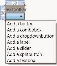
7.     Close MyToolBar.xaml, then reopen it again, the screen should show the following,
8.     Click the combo box; it will pop up the list,
9.     Select “Add a splitbutton”, and then click and select the new created splitbutton,
10.  Go to Properties panel.  Choose an icon, and enter for “Text”, “ToolTipText”, and “HelpContext”. Assign an unique ID to it.

11.  Click the combo box; it will pop up the list, select “Add a menuitem”
12.  Select the new created menu item.
13.  Go to Properties panel.  Choose an icon, and enter for “Text”, “ToolTipText”, and “HelpContext”. Assign a unique ID to it.

14.  Continue to add items
15.  Open Window1.xaml.cs.
Add the following code,
public partial class Window1 : LinsMDIWindow
{
public Window1()
{
InitializeComponent();

MyToolBar myToolBar = new MyToolBar();
myToolBar.ShowToolBar(this, null, null);
}
}


References:
Command,
Command Events,
Commands Manager,
Create a Command,
FlexToolBar,
Features,
How To,
Index,
Instruction,
LinsUIWPFDockingManager,
Tool Items Manager

Friday, February 13, 2015

FlexToolBar


FlexToolBar class
Provides a container for a group of commands or controls.
Examples
The following example shows how to create a FlexToolBar object.
public partial class MyToolBar : FlexToolBar
{
// ***** //
public partial class Window1 : LinsMDIWindow
{
public Window1()
{
InitializeComponent();

// Create a toolbar instance.
MyToolBar myToolBar = new MyToolBar();
// Show the toolbar.
myToolBar.ShowToolBar(this, null, null);
}
}
§  Constructors
1)  public FlexToolBar()
Remarks
Initialize a new instance of FlexToolBar
§  Members
1)  public virtual Rect Bounds { get; }
Remarks
Retrieve both the size and the location of the toolbar, in pixels, relative to its parent.
2)  public virtual Rect BoundsAtMDIFrame { get; }
Remarks
Retrieve both the size and the location of the toolbar, in pixels, relative to MDI frame.
3)  public virtual FLEX_DOCKING_ALIGN FlexDock { get; set; }
Remarks
Gets or sets which control borders are docked to its parent control. It can be one of the following values,
§   NONE:             
The control is not docked.
§   TOP:                
The control's top edge is docked to the top of its containing control.
§   BOTTOM:         
The control's bottom edge is docked to the bottom of its containing control.
§   LEFT:              
The control's left edge is docked to the left edge of its containing control.
§   RIGHT:             
The control's right edge is docked to the right edge of its containing control.
4)  public virtual long ID { get; set; }               
Remarks
Every FlexToolBar object should have a unique ID. If the user does not assign a number to the ID, a unique number which is larger than FlexConstants.m_nUserDefinedControlStartID (10,000,000) will be automatically generated and assigned to it. If the ID is between FlexConstants.m_nUserDefinedControlStartID (1000) and FlexConstants.m_nUserDefinedControlStartID (10,000,000), then once the toolbar is created, it will never been destroyed, and its layout will be persistent and customizable. You can always use LinsUIWPFDockingManager.GetToolBarFromAllPlacesByID() to retrieve its instance, once it is created.
5)  public FlexCollection<UIElement> Items { get; set; }               
Remarks
Gets or sets all tool items.
6)  public virtual bool NoAnimate { get; set; }
Remarks
Gets or sets the animation ability of the toolbar.
7)  public bool ShowTitle { get; }
Remarks
This member decides whether to show the title of the toolbar.
8)  public bool ShowToolTip { get; set; }
Remarks
This field decided if the tooltip will be shown, when the mouse hovers above one of tool items, if the tool item has a tooltip assigned to it.
9)  public string Text { get; set; }
Remarks
Gets or sets the caption of the toolbar.
§  Methods
1)  public virtual void Close()
Remarks
This closes the toolbar. If this toolbar is non-persistent (ID is larger than 10,000,000), the toolbar will be destroyed. 
2)  public void EnsureVisible(
FlexToolBarBaseButton visibleButton)      
Parameters
visibleButton
Type: FlexToolBarBaseButton
A tool item.            
Remarks
Move the tool item, visibleButton, into view area if it is outside the view area.
3)  public virtual bool HitTest(
Point ptMousePosAtMDIFrame)                 
Parameters
ptMousePosAtMDIFrame
Type: Point
A location which is in MDI Frame coordinate. 
Remarks
Test whether the point, ptMousePosAtMDIFrame, which is in MDI Frame coordinate, is inside this toolbar.
4)  public virtual Size MeasureSize(
bool bAddRemoveChildren,
FLEX_DOCKING_ALIGN nDockStyle)              
Parameters
bAddRemoveChildren
Type: bool
True, if the Add/Remove button will be displayed at the toolbar title area. 
nDockStyle
Type: FLEX_DOCKING_ALIGN
The dock style of the toolbar. 
Remarks
This calculates how much space the toolbar requires. If the user wants to customize the toolbar, this method may need to be overridden by the user.
5)  public virtual bool ShowToolBar()              
Remarks
This makes the FlexToolBar object visible and adds the toolbar into the mainframe of the application. The FlexDock attribute of the toolbar will decide the attached border of the mainframe. 
6)  public virtual bool ShowToolBar(
DependencyObject parent,
Int? nBand,
Int? nBandIndex)     
Parameters
parent
Type: DependencyObject
The toolbar is going to be added into this parent container. The parent object should be one of the following three types, LinsMDIFrame, FlexDocument, or FlexPanel. If parent is null, it means that this toolbar will be added into LinsMDIFrame(mainframe).
nBand
Type: int?
The index of the row that the toolbar will be inserted. If nBand is null, then this toolbar will be appended.
nBandIndex
Type: int?
The index of the column that the toolbar will be inserted. If nBandIndex is null, then this toolbar will be appended.           
Remarks
This makes the FlexToolBar object visible and adds the toolbar into the parent container. The FlexDock attribute of the toolbar will decide the attached border of the parent container. 
§  Events
1)     public event DockStyleChangedEventHandler DockStyleChanged              
Remarks
This event is fired when the FlexDock attribute of the toolbar has changed.  
2)     public event NotifyCollectionChangedEventHandler VisualChildrenChanged              
Remarks
This event is fired when any tool item is added or removed from the toolbar.  


Demo


References:
Command,
Command Events,
Commands Manager,
Create a Command,
Create a ToolBar,
Dynamically Link a Tool Item to a Command Existed in an Optional Assembly,
Features,
How To,
Index,
Instruction,
LinsUIWPFDockingManager,
Tool Items Manager

FlexToolBarButton


FlexToolBarButton class
It derived from FlexToolBarBaseButton. This tool item reacts to user input from a mouse, keyboard, stylus, or other input device.
Examples
The following example shows how to use the CommandID attribute of a tool item.
public partial class CopyButton : FlexToolBarButton
{
public CopyButton() : base()
{
// ******* //
CommandID = COPY_COMMAND_ID;
}
}

class CopyCommand : LinsUICommand
{
public CopyCommand(long nCommandID, object data) : base(nCommandID, data)
{
// Assign a help file to this command. The help file must be stored at the location
// specified by FlexUISettings.DefaultHelpFilePath,
HelpFile = "Copy.rtf";
// Assign a short-cut key to this command.
InputKeyGesture = new System.Windows.Input.KeyGesture(
System.Windows.Input.Key.C,
System.Windows.Input.ModifierKeys.Control);
}

public override void Execute(object parameter)
{
base.Execute(parameter);

// Execute your command //
}

[CommandEventAttribute(COMMAND_EVENT.HELPBUTTON_CLICK)]
protected void HelpClick(object sender, EventArgs e)
{
// ******* //
}

[CommandEventAttribute(COMMAND_EVENT.KEY_UP)]
protected void OnKeyUp(object sender, EventArgs e)
{
if (!(e is KeyEventArgs))
{
return;
}
KeyEventArgs keyEvent = e as KeyEventArgs;

// ******* //
}

public override bool CanExecute(object parameter)
{
return true;
}
}

public partial class MainWindow : LinsMDIWindow
{
public MainWindow()
{
InitializeComponent();
CreateCommands();
}

private void CreateCommands()
{
// Create COPY command instance
LinsUICommand command = new CopyCommand(COPY_COMMAND_ID, null);
}
}

§  Constructors
1)  public FlexToolBarButton()
Remarks
Initialize a new instance of FlexToolBarButton
§  Members
1)  public virtual ToolBarItemDisplayStyle Appearence { get; set; }
Remarks
Gets or sets the appearance of the tool item. The default is ToolBarItemDisplayStyle.ImageAndText. It can be one of the following values,
§   None:             
Assigned Text and assigned Icon are to be rendered.
§   Text:                
Only Text is to be rendered.
§   Image:         
Only Icon is to be rendered.
§   ImageAndText:              
Both Text and Icon are to be rendered.
2)  public virtual Rect Bounds { get; }
Remarks
Retrieve both the size and the location of the tool item, in pixels, relative to its parent.
3)  public virtual Rect BoundsAtMDIFrame { get; }
Remarks
Retrieve both the size and the location of the tool item, in pixels, relative to MDI frame.
4)  public virtual bool Checked { get; set; }
Remarks
Gets or sets the check status of the tool item. The default is false.
5)  public long CommandID { get; set; }               
Remarks
If this attribute is assigned, then this tool item will be associated to the correspondent command with the same CommandID. See the above example for creating a command. 
6)  public FontFamily Font { get; set; }
Remarks
Gets or sets the font of the tool item. The default is SystemFonts.MenuFontFamily.
7)  public Color FontColor { get; set; }
Remarks
Gets or sets the font color of the tool item. The default is SystemManager.FlexParameters.DefaultToolItemFontColor.
8)  public double FontSize { get; set; }
Remarks
Gets or sets the font size of the tool item. The default is SystemFonts.MenuFontSize.
9)  public FontStyle FontStyle { get; set; }
Remarks
Gets or sets the font style of the tool item. The default is normal.
10)public FontWeight FontWeight { get; set; }
Remarks
Gets or sets the font weight of the tool item. The default is normal.
11)public string HelpContext { get; set; }
Remarks
Gets or sets the help content for the tool item. If this tool item has been associated to a command (CommandID attribute is assigned), then this attribute will be ignored, instead the COMMAND_EVENT.HELPBUTTON_CLICK event defined inside the correspondent command will be executed once the help button on the tooltip is clicked.
12)public string HelpFile { get; set; }
Remarks
Gets or sets the help file for the tool item. If this tool item has been associated to a command (CommandID attribute is assigned), then this attribute will be ignored, instead the COMMAND_EVENT.HELPBUTTON_CLICK event defined inside the correspondent command will be executed once the help button on the tooltip is clicked.
13)public virtual ImageSource Icon { get; set; }
Remarks
Gets or sets the icon of the tool item.
14)public double IconSize { get; set; }
Remarks
Gets or sets the icon size of the tool item. The default is 16 pixels.
15)public virtual long ID { get; set; }               
Remarks
Every tool item should have a unique ID. If the user does not assign a number to the ID, a unique number which is larger than FlexConstants.m_nUserDefinedControlStartID (10,000,000) will be automatically generated and assigned to it. If the ID is between FlexConstants.m_nUserDefinedControlStartID (1000) and FlexConstants.m_nUserDefinedControlStartID (10,000,000), then once the tool item is created, it will never been destroyed, and its layout will be persistent and customizable. You can always use LinsUIToolItemManager.GetToolItem() to retrieve its instance, once it is created.
16)public bool IsCheckable { get; set; }
Remarks
Gets or sets the check ability of the tool item. The default is false.
17)public virtual bool IsSubMenu { get; }
Remarks
True, if the tool item has sub-items, for example, a dropdown button.
18)public virtual TextImageRelation Relation { get; set; }
Remarks
Gets or sets the appearance of the tool item. The default is TextImageRelation.TextBeforeImage. It can be one of the following values,
§   Overlay:             
The Icon and the Text share the same space.
§    ImageAboveText:                
The Icon is displayed vertically above the Text.
§   TextAboveImage:         
The Text is displayed vertically above the Icon.
§   ImageBeforeText:              
The Icon is displayed horizontally before the Text.
§   TextBeforeImage:              
The Text is displayed horizontally before the Icon.
19)public string Text { get; set; }
Remarks
Gets or sets the text of the tool item.
20)public string ToolTipText { get; set; }
Remarks
Gets or sets the tooltip of the tool item.
§  Methods
1)  public virtual bool HitTest(
Point ptMousePosAtMDIFrame)                 
Parameters
ptMousePosAtMDIFrame
Type: Point
A location which is in MDI Frame coordinate. 
Remarks
Test whether the point, ptMousePosAtMDIFrame, which is in MDI Frame coordinate, is inside this tool item.
2)  public virtual Size MeasureSize(
bool bDropDown,
FLEX_DOCKING_ALIGN nDock)              
Parameters
bDropDown
Type: bool
True, if this tool item is on a dropdown list, for example a context menu or a sub-menu.            
nDock
Type: FLEX_DOCKING_ALIGN
The docking style of the tool item’s container. Always pass in FLEX_DOCKING_ALIGN .TOP, except the container is a FlexToolBar, and then pass the toolbar’s FlexDock. attribute.            
Remarks
This calculates how much space the tool item requires. If the user wants to customize the tool item, this method may need to be overridden by the user.
3)  public virtual void Refresh()              
Remarks
This forces to redraw the tool item. 
§  Events
1)     public event ClickEventhandler ClickEvent              
Remarks
This event is fired when the tool item is clicked.  
2)     public event RoutedEventHandler GotFocus              
Remarks
This event is fired when the tool item receives focus.  
3)     public event RoutedEventHandler LostFocus              
Remarks
This event is fired when the tool item lost focus.  


References:
Assign a Help Document to a Tool Item,
Command,
Command Events,
Commands Manager,
Create a Command,
Create a Custom Tool Item,
Dynamically Link a Tool Item to a Command Existed in an Optional Assembly,
Features,
FlexToolBarBaseButton,
How To,
Index,
Instruction,
Tool Items Manager